ShopDreamUp AI ArtDreamUp

Deviation Actions


Description
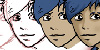
Cover for the 1st volume of Okamirai! (Chapters 1-6 + Extras!)
This cover was a lot of fun to do (especially the city! :3). I wanted to show both the Yokai World(well a portion of it) and Human World. I used Copic and Sakura Pigma multiliners for inking and Copic markers for coloring.
Volumes will be available in the next few months! As well as T-shirts, bookmarks, buttons as well as a Raiju plushie!~
If you'd like to receive updates when new chapters/pages are released, you can create an account on MangaMagazine.net and subscribe by clicking the 'add to favorites' button. Up to chapter 19 is online now: [link] OuO
Image size
750x978px 1.54 MB
© 2013 - 2024 TakkunArt
Comments21
Join the community to add your comment. Already a deviant? Log In
Great job, as usual. Excellent gesture on Jin and solid expressions. The cityscape is well rendered as well.
I do feel there are some area for improvement. The heavy unshaded black tone used on Jin's shirt makes it feel very flat. There's a very Oda influence to your work, (nothing wrong with that, I love the guy) and he does the same thing with flat blacks on colored works. Just keep in mind that it can be a little heavy and cause the rendering to look flat.
Jin's shorts and and straps can get lost in the background around him. Using a blue that more chromatically different the background can help with that problem in the future.
A similar issue happens with the foliage in the cityscape. Because the foreground foliage is the same chroma scale as the foliage on the buildings it gives the illusion that they are floating. As object recede in the background atmospheric perspective causes their colors to become more muted and shifted towards blue.
This is more aesthetic, but in the pose you've given Jin it's typical for artist to not render the legs below the knee because it frequently comes off looking awkward.
Again, great work. Keep it up!